Relics Home Decor
Brand Identity Design : Rationale / Design Thinking
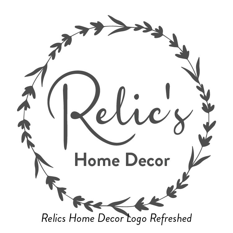
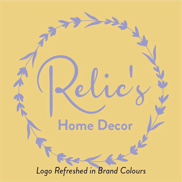
The refreshed Relics Brand Identity speaks to the core values of the business, the business owners, the client and the community it serves, as unearthed together during our Brand Facilitation day.
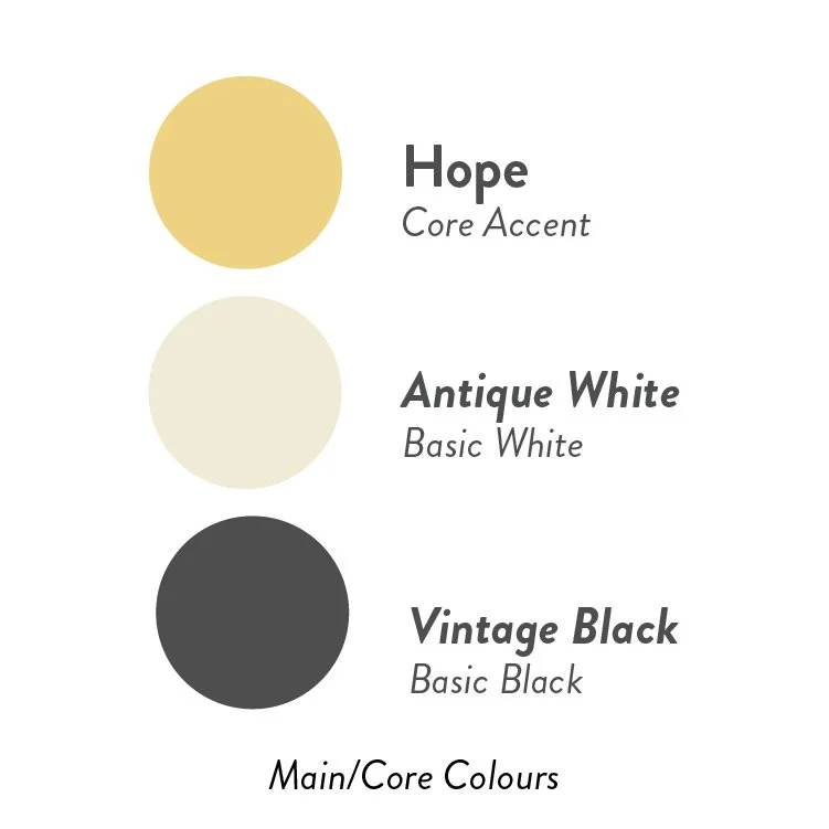
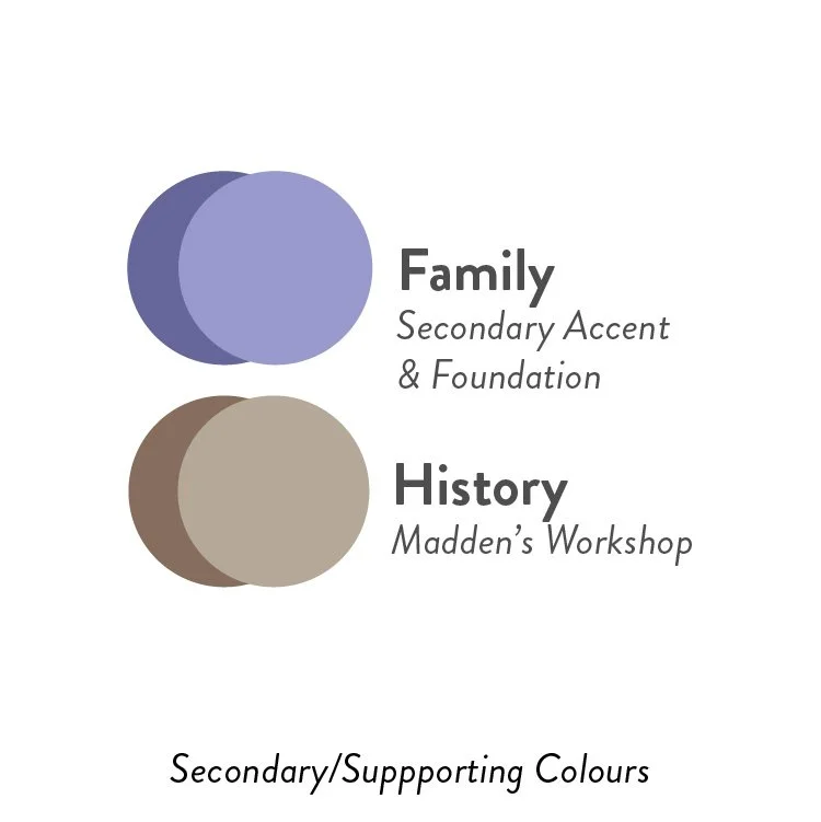
The core colours represent iconic moments in the Madden and Relics trajectory. They represent moments of brilliance, moments of family connectedness, and moments rooted in history, community, and in the creation of unique handcrafted pieces that will stand the test of time. (Hope Yellow, Family Lavender, History Brown). As for the ‘white’ and ‘black’, again, shifting things of times past, and faded lends the essence of time to these basic colours or neutrals. (Antique White, Vintage Black)
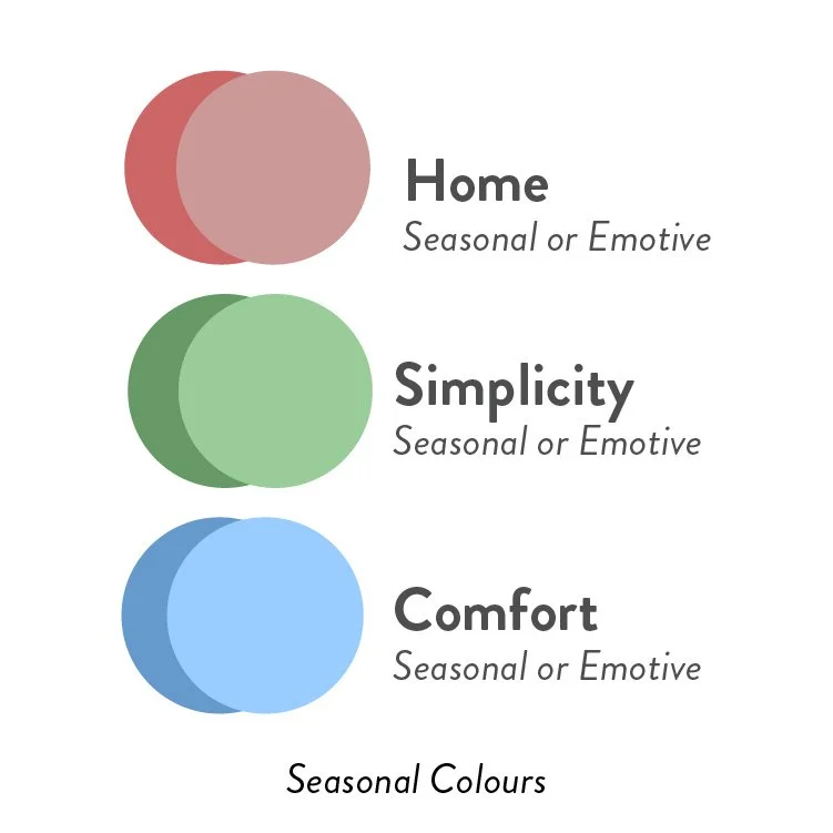
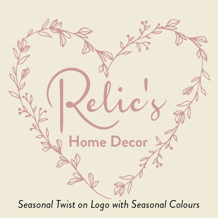
As the seasons change, and our families grow, our heart goes through the motions and moments of life, as does the Relics logo. In simply changing the ‘wreath’, and effectively using the custom colour system, The Relics logo also goes through the motions of seasons and celebrations along with the clients they serve. (Home Red, Simplicity Green, Comfort/Pride Blue)
The fonts get a gentle update, and stay simple, feminine and emotive in the scripted ‘Relic’s’, and throws back a bit further to the fifties with the sans-serif ‘Home Decor’.
Together, all the design elements of your refreshed Brand Identity keeps the whole Brand Story front and centre. The various iterations embody not only the brand values and the seasonal shifts of life surrounding the business, but also the diversity of clients in the community you serve.
BUSINESS COMMERCE WEBSITE
Design Thinking
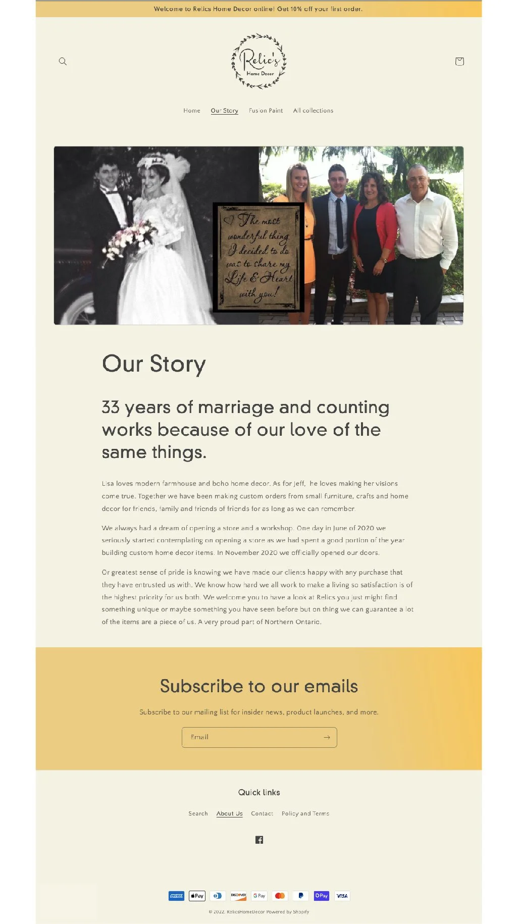
The first take of design implements some of the colours I expressed in your refreshed Brand Identity.
As you will see, the antique white creates a gentle warmth along with Hope Yellow (concept 1 homepage, and other pages). And in the second (concept 2 homepage), the white is clean and of course, in this purchasing online setting works well at keeping the customer focused on content. Either direction gives you a feel for what the experience will be like.
The story telling happens in between things, roughly conveying my vision for an emotive website with warmth, not shying away from showing what you stand for, where you originated, and what you believe in (as seen in ‘Our Story’, and with the added storytelling breaking up sales content on the homepage). This authentic communication, and personal appeal, I believe will connect with your customers, and friends as clients.
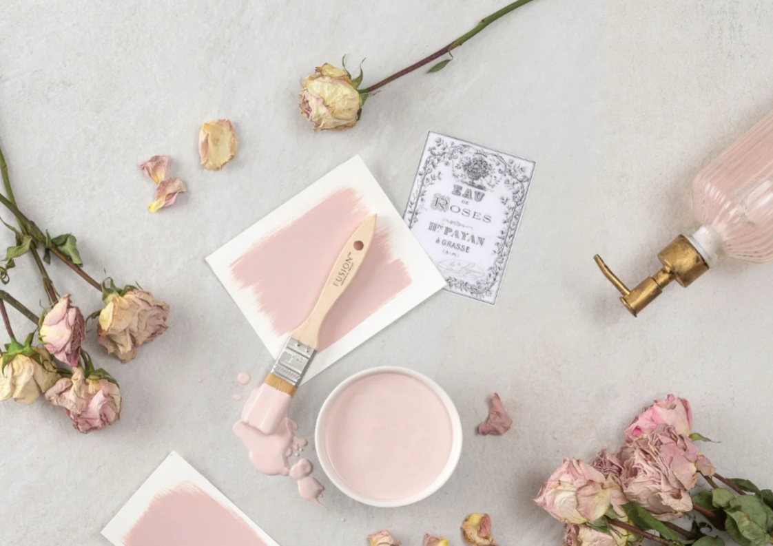
Also shown are the Collections page, Product page, and Cart page. The whole gives you a general look and feel for how the purchasing cycle will unfold and how your online shopping experience will feel.