Maa Yoga + Wellness Studio Case Study
World-building the foundational brand ecosystem for a premier wellness sanctuary and digital community.
A true community oasis is cultivated over decades of deep alignment—spanning intimately across the physical mat and into the digital space.
Before Maa Yoga opened its doors, and while Farhad was setting up his first studio space, he sought a visual translation that matched the quiet, restorative sanctuary they were offering the local community. The design objective was clear from the start: the brand needed to feel sacred, aligned, and serene, while operating within the highly disciplined, technical framework of a scaling yoga studio business.
Having designed the visual foundation of the website for Yogapod—the definitive benchmark of early-millennium wellness spaces—Farhad was recommended to seek me out for help in designing a logo, with equal sophistication.
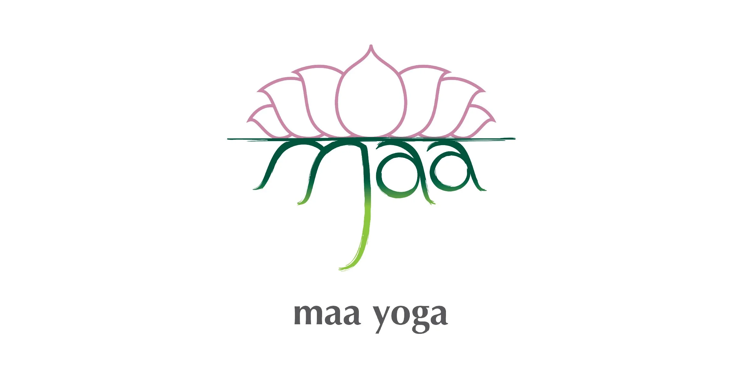
We met in a quiet coffee shop as complete unknowns. Me with a sketchpad in hand, he in a grey cardigan, both our eyes alive with the anticipation of what could be. As he mapped out his expansive plans, I quietly listened, sketching a small lotus on the page. When he paused, I turned the book around. He looked at the sketch and wept. In that single shared moment, his entire heart, mind, and soul had been translated into form. That was the beginning of a fifteen-year journey as true co-creators. Moving with shared power, we formed an intuitive mastermind—synergistically translating a beautiful vision into the living, breathing light of Maa Yoga + Wellness Studio.
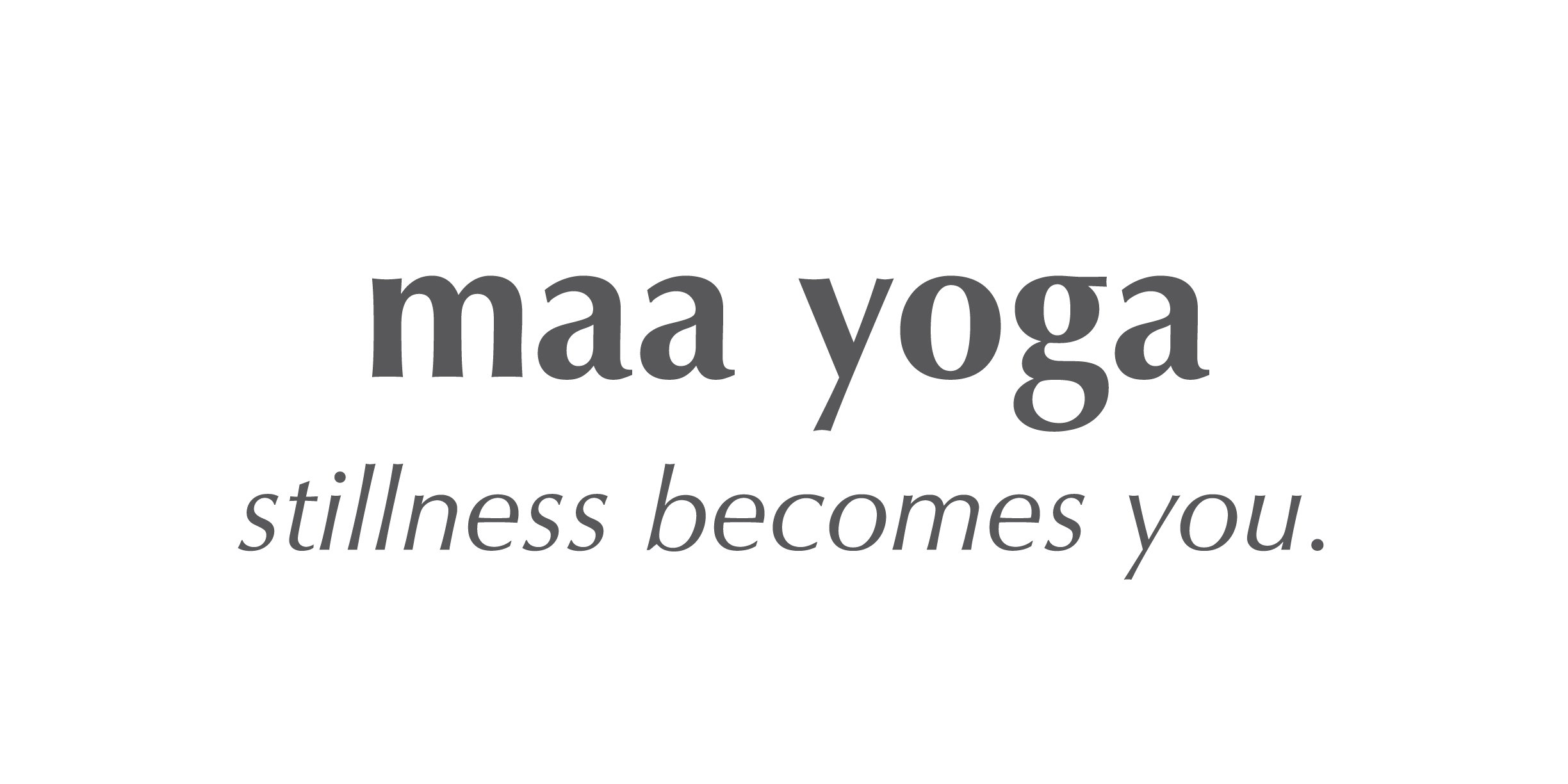
“Stillness becomes you.”
As the market shifted, the brand structure evolved naturally while preserving its core character. This long-term collaboration unfolded through intuitive brainstorming, anticipated sales cycles, seasonal pass sales, monthly workshops, off-site retreats, and steady community growth.
We integrated online services for livestreams and digital teaching classes, expanding their reach to serve the community, and the business, flawlessly.
That sustained alignment continuously translated Farhad’s vision into a tangible, distinguishable form across every touchpoint.
From a single local space to a highly resolved brand ecosystem: clear, cohesive, and structurally enduring.
The multi-year engagement delivered a cohesive, unified foundational system:
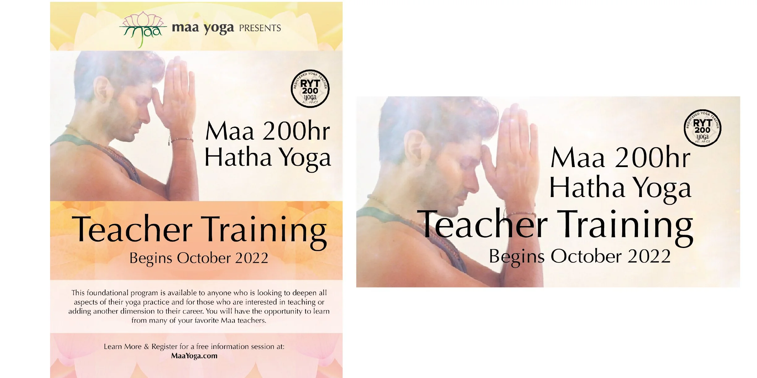
Brand Strategy & Identity: Archetype alignment, bespoke logomark typography, and a calming, cohesive colour story.
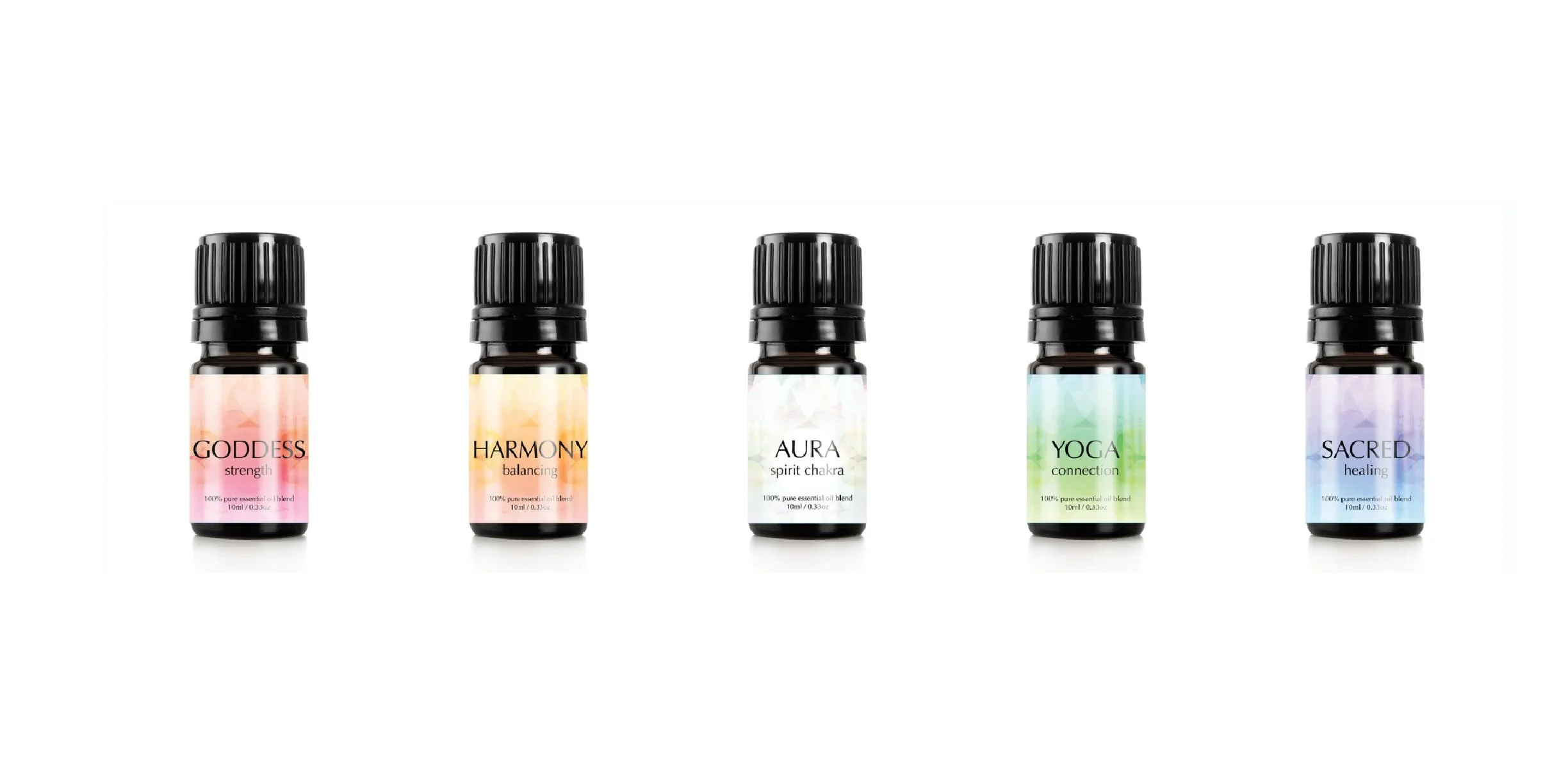
Product & Service Branding: Premium design execution for diverse physical workshops, seasonal retreats, and community event marketing.
Digital Ecosystem: Comprehensive website design, custom platform integrations, and intuitive, minimalist category systems.
Asset Governance: Clear, creative, and structural guidelines to keep their visual identity completely consistent across fifteen years of continuous growth.
The Evolutionary Bridge.
As the physical sanctuary model concluded its fifteen-year chapter, this rich visual lineage did not disappear. It evolved. Explore the Farhad Khan Case Study to see how this deep foundational alignment transitioned from a local sanctuary into a boundless, traveling personal brand ecosystem.